Caroline Del Vecchio

Caroline Del VecchioCaroline Del VecchioCaroline Del Vecchio
  • Home
  • Design Portfolio
  • About
  • More
    • Home
    • Design Portfolio
    • About

Caroline Del Vecchio

Caroline Del VecchioCaroline Del VecchioCaroline Del Vecchio
  • Home
  • Design Portfolio
  • About
2020

In Good Company Workshops

Developing a design system and establishing brand standards for In Good Company's workshop materials. 

About In Good Company

In Good Company is a MassMutual learning initiative that was created to break the mold of traditional financial education offerings. Their workshops cover relevant financial topics and provide know-how and support to empower attendees. 


The workshops are In Good Company's featured 'product' with the workbook and interactive class activities as the major physical touchpoints. The workbook is important because it carries In Good Company's branding beyond the experience; it is one of the only items that an attendee gets to take home with them after a workshop.

THE ASK

identified Adjustments

THE OPPORTUNITY

 At In Good Company, workshop materials are updated on a yearly basis to include the most recent financial information. In the beginning of 2020, the Product Development team wanted to take this yearly updating period to refresh the design of workshop materials, starting with the flagship offering: The Evergreen Series.


As the design lead on the project, I was asked to establish a design system that could be applied to both series and individual workshop formatting, while maintaining some existing visual elements that had already shaped the brand.

THE OPPORTUNITY

identified Adjustments

THE OPPORTUNITY

In Good Company, as a brand, was created within a fast timeline, resulting in materials that were on-brand but not necessarily standardized. The opportunity to create and implement design standards for the workbooks would not only improve the consistency of the product, but also would speed up the workshop development process down the road. 


Throughout the project I had to keep in mind that while the graphic possibilities are endless, the redesign should always circle back to prioritize improving the end-users experience and understanding of the workshop/workbook content.

identified Adjustments

identified Adjustments

identified Adjustments

•  Current workbook does not have the name of the series included anywhere.


•  All series workbooks had the same cover and cover page, making it difficult to tell workbooks apart at a glance.


•  Opportunity for additional messaging and workbook disclosure on first internal page.


•  While visually interesting, the Table of Contents could be more helpful to end-users if it included page numbers.


•  Section Title Pages could include workshop key takeaways, since that information is only outlined in the presentation at this point.

Redesigned Series workbook layouts

Welcome Page

Table of Contents

Table of Contents

By utilizing the cover page of the series workbooks as a Welcome Page, the workshop attendees could be introduced In Good Company and its mission.

Table of Contents

Table of Contents

Table of Contents

The Table of Contents was modified to include specific section titles and page numbers so that attendees could easily find content when referring back to the workbook. Moving this information to the Table of Contents also allowed for the Key Takeaways of each workshop to be included on the Section Title Pages.

Section Title Page

Section Title Page

Section Title Page

This layout was selected because it maintained original workbook design elements and could easily be adapted for individual workshop workbook covers. The Key Takeaways section was also added to frame the objectives of the proceeding workshop

Next Steps Section

Section Title Page

Section Title Page

 Before the redesign, this section only existed in some workbooks but not all. In the redesign, this section was added to every workbook, with the financial questions changing for each workbook to relate to the subject of that workshop. Having this section at the end of workbook will encourage workshop guests to bring the workbook with them to their Discovery Meeting. 

updated visual elements

Internal Page Formatting Overview

 Standards for design elements were re-established such as font size and color, margins, line spacing, and use of icons/graphics. These standards were applied to both series and individual workshop materials.
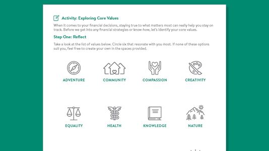
More Iconography

Since icons are a staple for In Good Company's visual brand language, they were added to activities and copy heavy pages to bring more visual interest and scannability to the pages.

Workshop Specific Visuals

Standards for workshop specific visuals were established through the use of black & white imagery as well as shaded icons. These visuals will always appear together along with the name of the workshop for visual consistency and recognition in both product and marketing efforts.

Materials

 The series workbooks maintain the stiff, craft paper covers and spiral binding, but include the name of the series and the In Good Company horizontal brandmark, allowing employees to know the workbook contents at a glance when packing materials for an engagement.

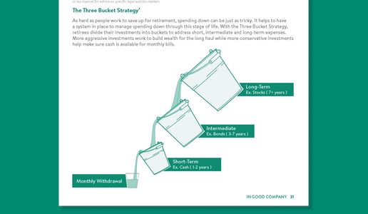
Updated Illustration Style

For complex topics that needed an additional visual aid, a new illustration style was established. Illustrations like the one above, match the aesthetics of In Good Company branded graphs and charts and help to diversify the visuals within a section.

reformatting to remote

The workbook design system was finalized in late February 2020. When the COVID-19 Pandemic forced companies to begin working from home, I was tasked to once again reimagine the In Good Company workshop materials. This time, the goal was to maintain the workshops’ interactivity and the newly established brand standards, while delivering a digital experience.


This redesign had a much tighter turn around than the prior, because workshops could not start running again until we had a remote structure in place. With that in mind, the workbook was recreated into an interactive Microsoft Word document. 

Considerations

Accessible

Content Protection

Content Protection

 Microsoft Word was chosen over an interactive pdf based on 

end-user considerations. While interactive pdfs can offer the same, if not more functionality than an interactive Word document, it was a safer bet to assume that companies we would be partnering with would have the Microsoft Office Suite on their computers.

Content Protection

Content Protection

Content Protection

 Developer tools in the program were used to create editable fields, so that users could interact with the digital document in the same way they would with a physical workbook. 


Microsoft Word also enabled a way that all information in the document, besides the editable fields, could be locked. This ensured that no teaching points could be accidently deleted from the document.

Printer-Friendly

Content Protection

Printer-Friendly

While the idea was to move to a digital experience, we wanted to acknowledge that not everyone likes working on the computer and give attendees the option to print the materials if desired.

Remote workbook at a glance

Grey shaded areas represent editable fields within the document.

Try It Out

Check out In Good Company's Exploring Core Values activity below and see for yourself how the interactive word document works

CDelVecchio-InGoodCompany-RemoteValuesActivity (docx)

Download

Copyright © 2022 Caroline Del Vecchio - All Rights Reserved.

  • IGC WORKSHOPS
  • IGC WEBSITE REFRESH
  • IGC PROMOTIONAL MATERIALS
  • MERCANTILE WEBSITE
  • DRAWINGS & ILLUSTRATIONS
  • SOCIAL INTERACTION
  • HIDDEN DISABILITIES
  • COLLABORATIVE STORYTIME
  • PWR HOUSE
  • DIGITAL RECIPE BOX
  • TODDY TO-GO

cadelvecchio.design@gmail.com